Kelvin Design System shared visual language
This is a teaser of the project and does not show the entirety of the case study.
Project
Kelvin was growing fast and signing more clients. Teams were shipping one off solutions and creating a ton of design and engineering debt. Customers were experiencing a UI that wasn't cohesive and our customer support team was spending time addressing UI questions. I worked with the Design team and our engineers to create and define a small, but mighty design system library for Kelvin.
Icons
One of the initiatives of this design system was defining a visually cohesive icon family. We aimed to achieve visual consistency, clarity, brand recall and scalability as the icons at Kelvin grew. Our icon family would prioritize web, with mobile next and tablet in mind.
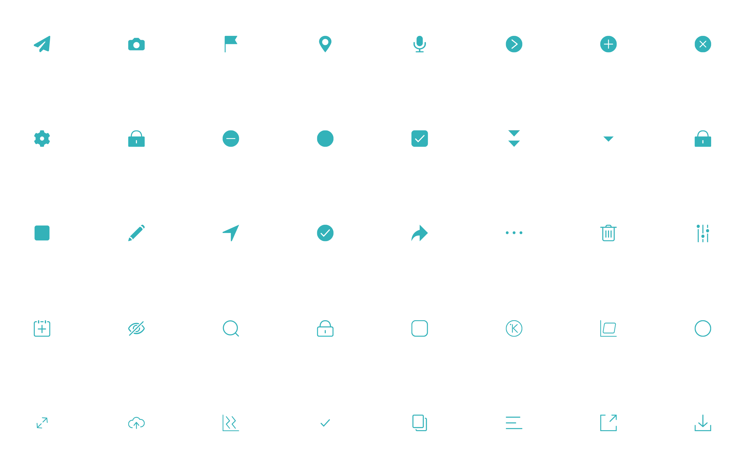
Icon Audit
We performed a UI Audit of Kelvin’s existing iconography and tried to understand their evolution and purpose. I documented and categorized each icon in Kelvin noting its context, location, placement, size, and their platform. Icons are used to compliment text or as stand alone actions. They are used on both dark and light backgrounds. We kept brand in mind and how the Kelvin brand is perceived. We wanted to create an icon family that was: confident, resourceful, curious, intentional.
Inspiration
The visual design direction was inspired by Frank Lloyd Wright, who believed in creating harmony with people and nature. The design focused on a geometry that was inspired by natural forms such as symmetry, and smooth and rounded curves.
Style
The style is purposeful, light and balanced. The icons have variations of outlined and filled depending on their context and text compliment. Their symmetry makes them quick to understand. Their forms are flat and have a single color usage that ensures readability.

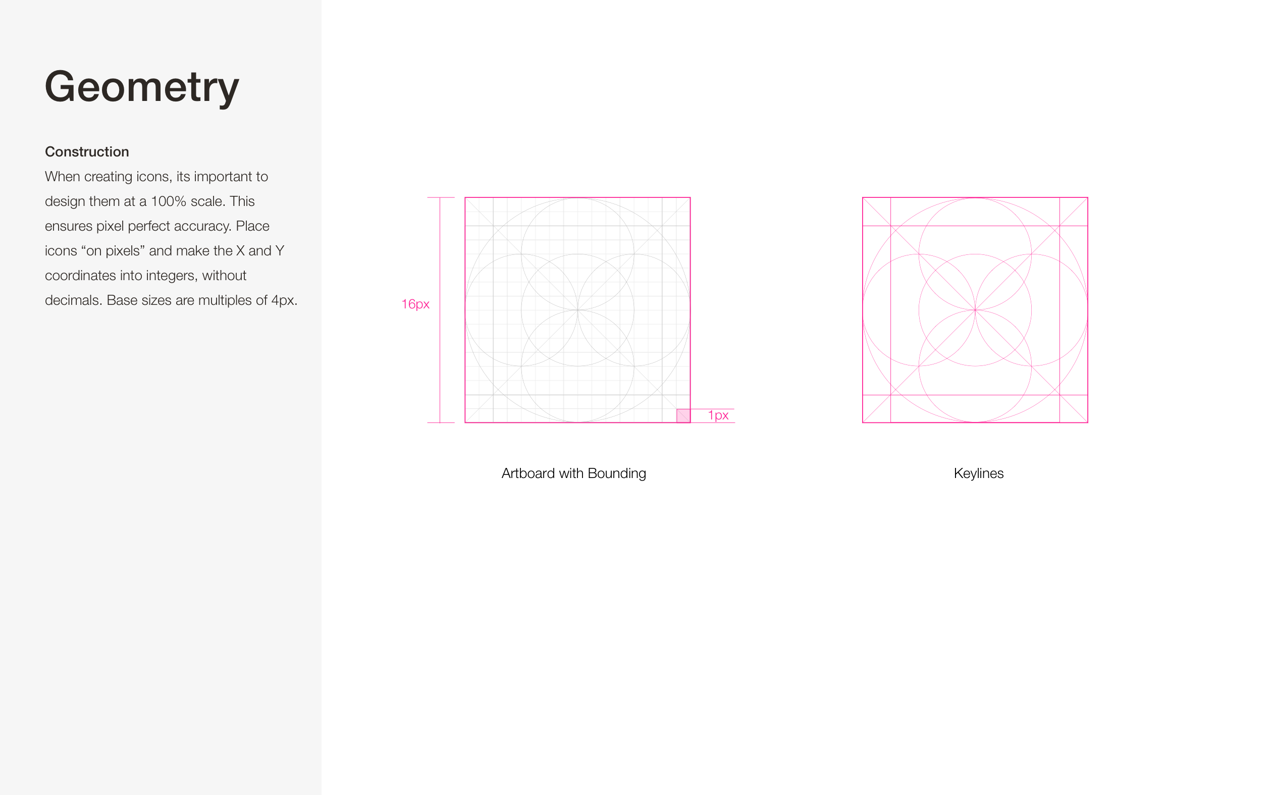
Geometry
Their construction is based on a 4px multiple inspired by Material Design. The icons are on pixels and integers have no decimals. They correspond to organic feeling keyline core shapes.
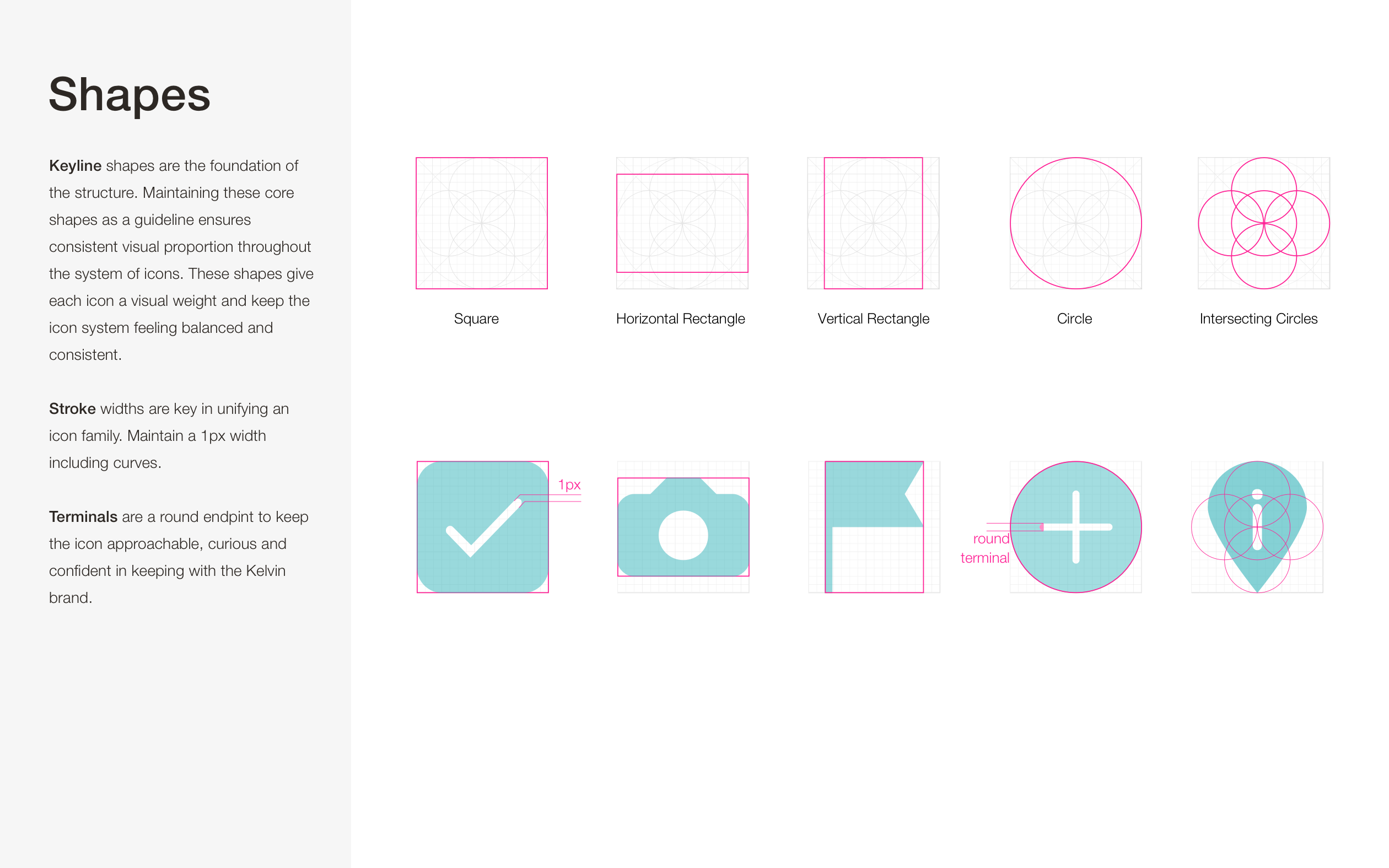
Shapes
Keyline shapes are the foundation of the icon structure. Maintaining these shapes ensures visual proportion and consistency at scale. The widths maintain a 1px including curves. Terminals are rounded.
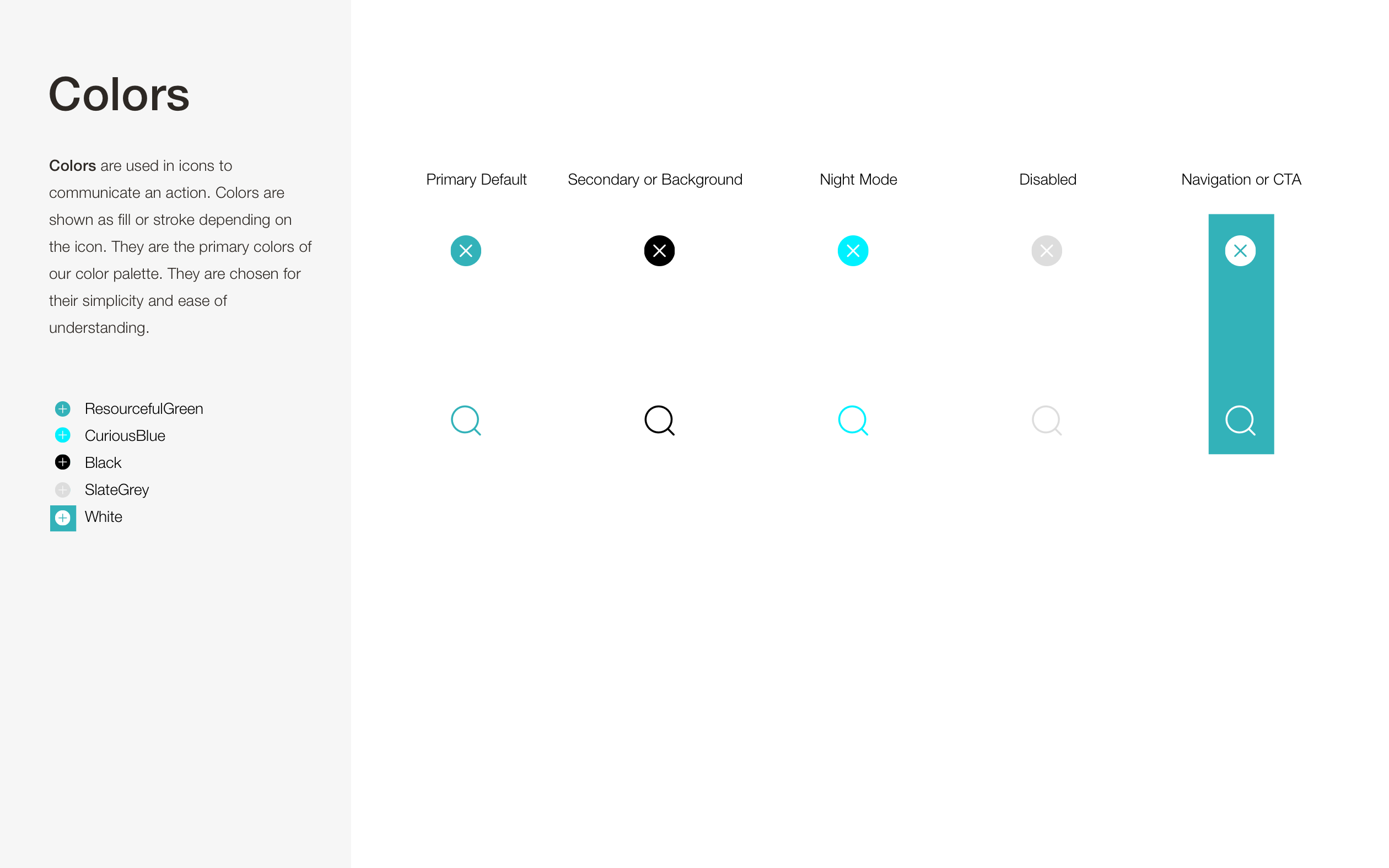
Colors
Colors are intentional and communicate the brand and product meaning and corresponds to Kelvin's primary colors.
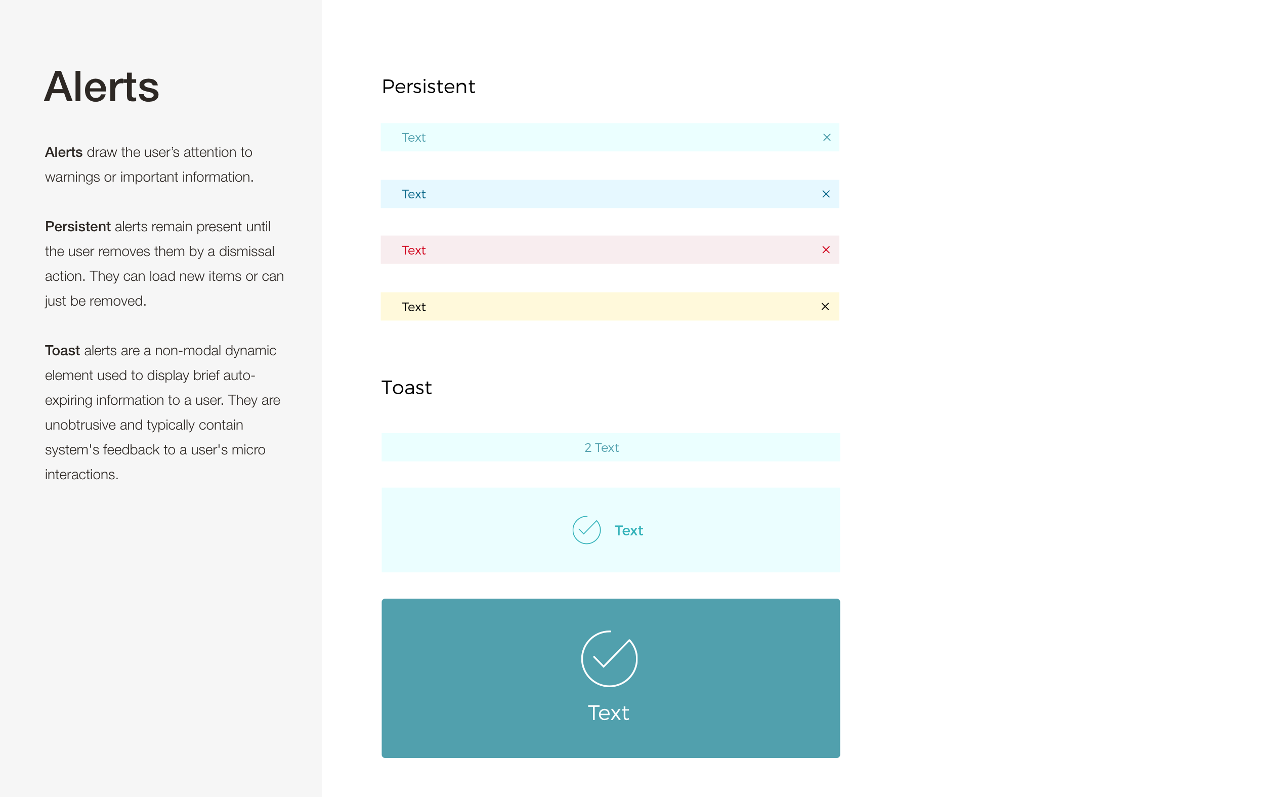
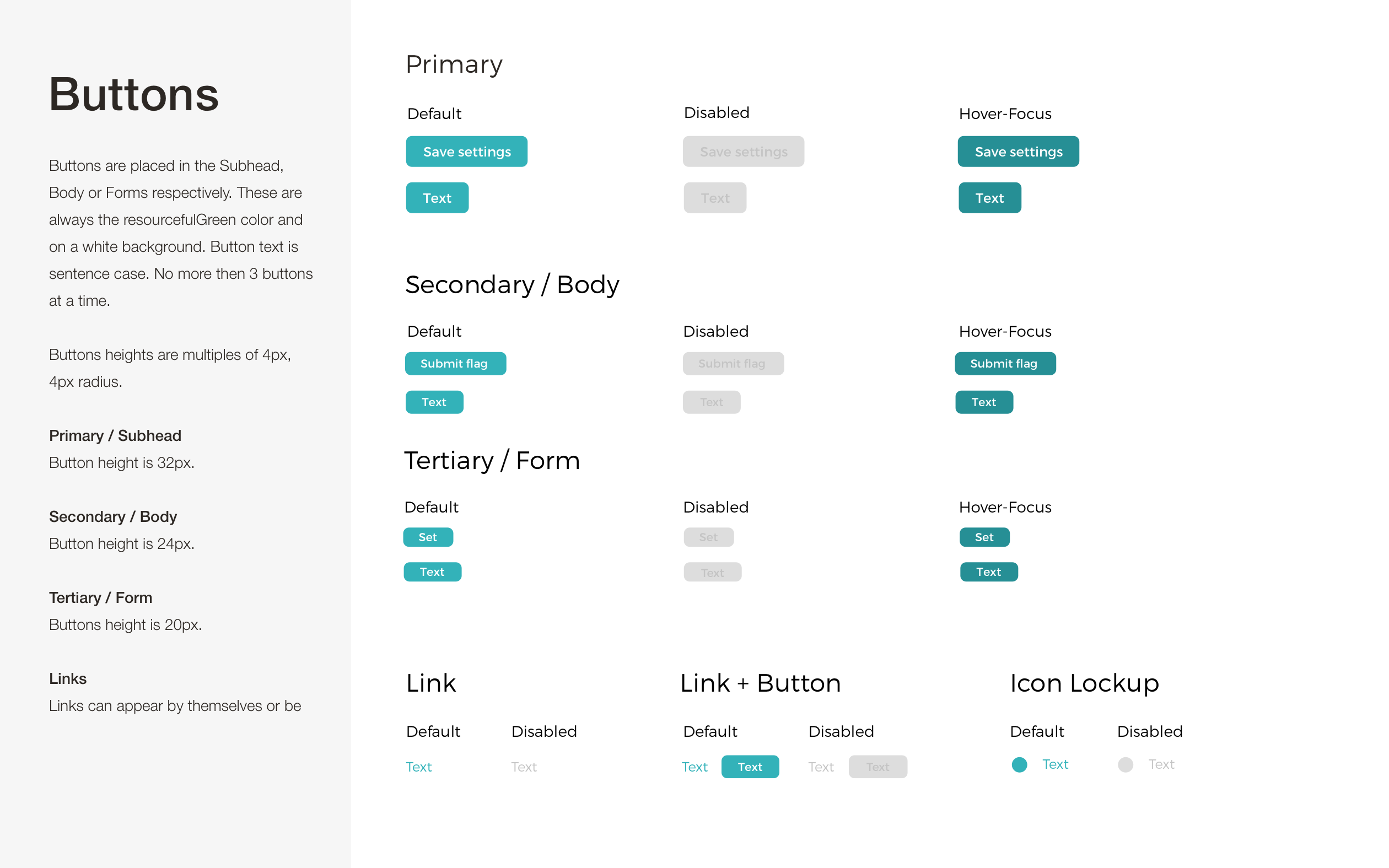
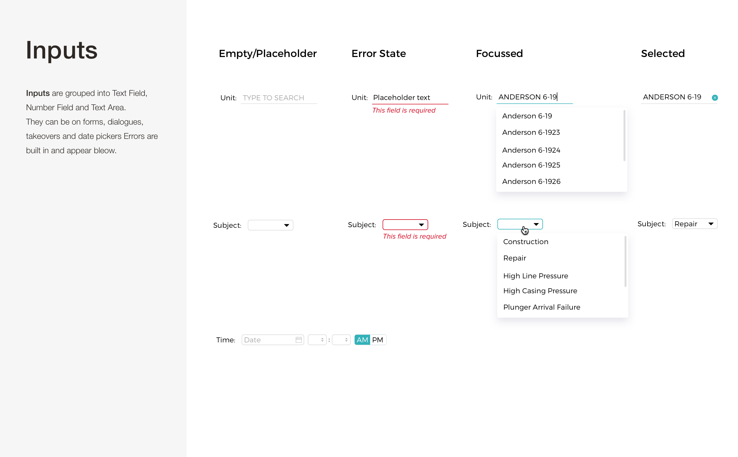
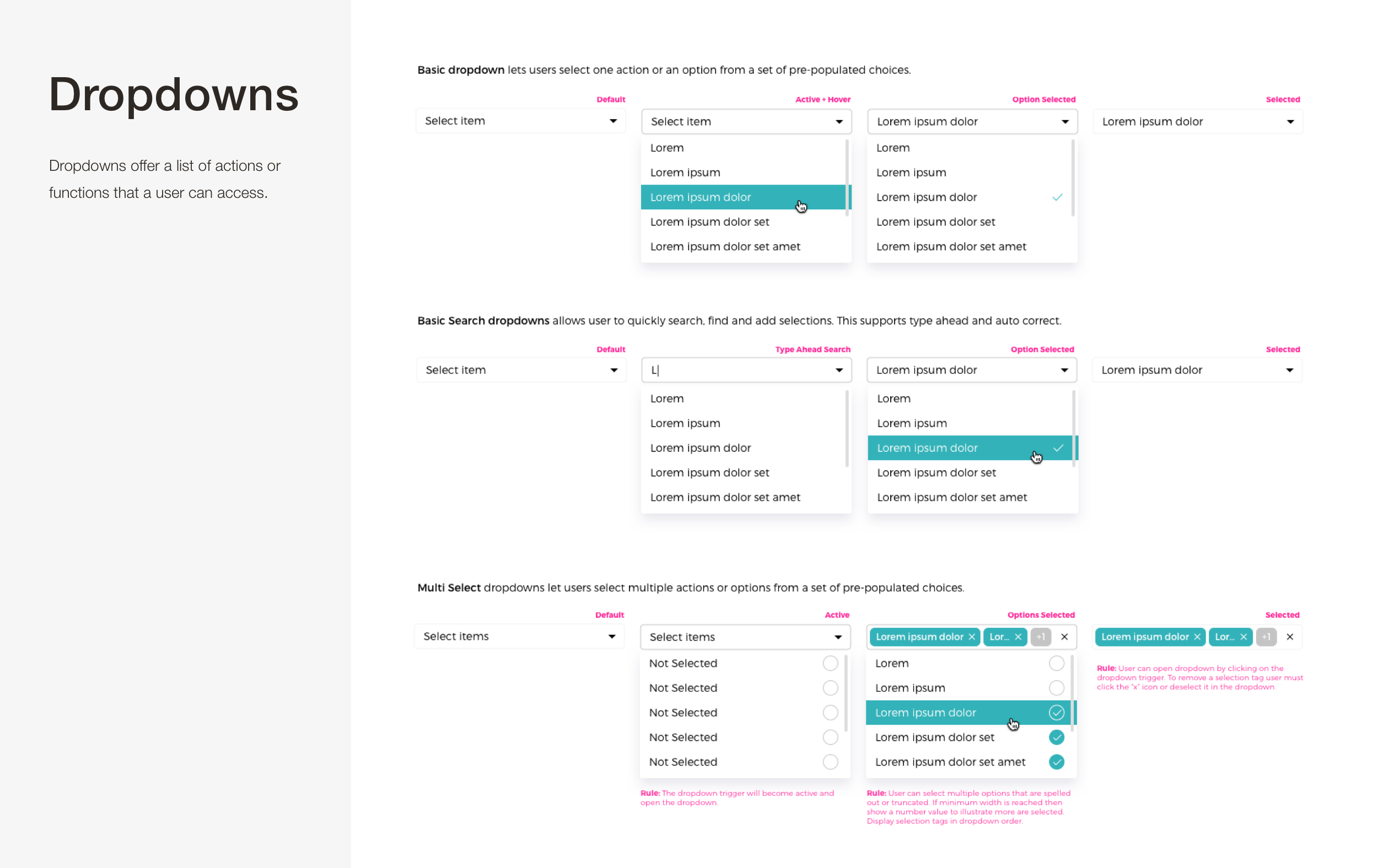
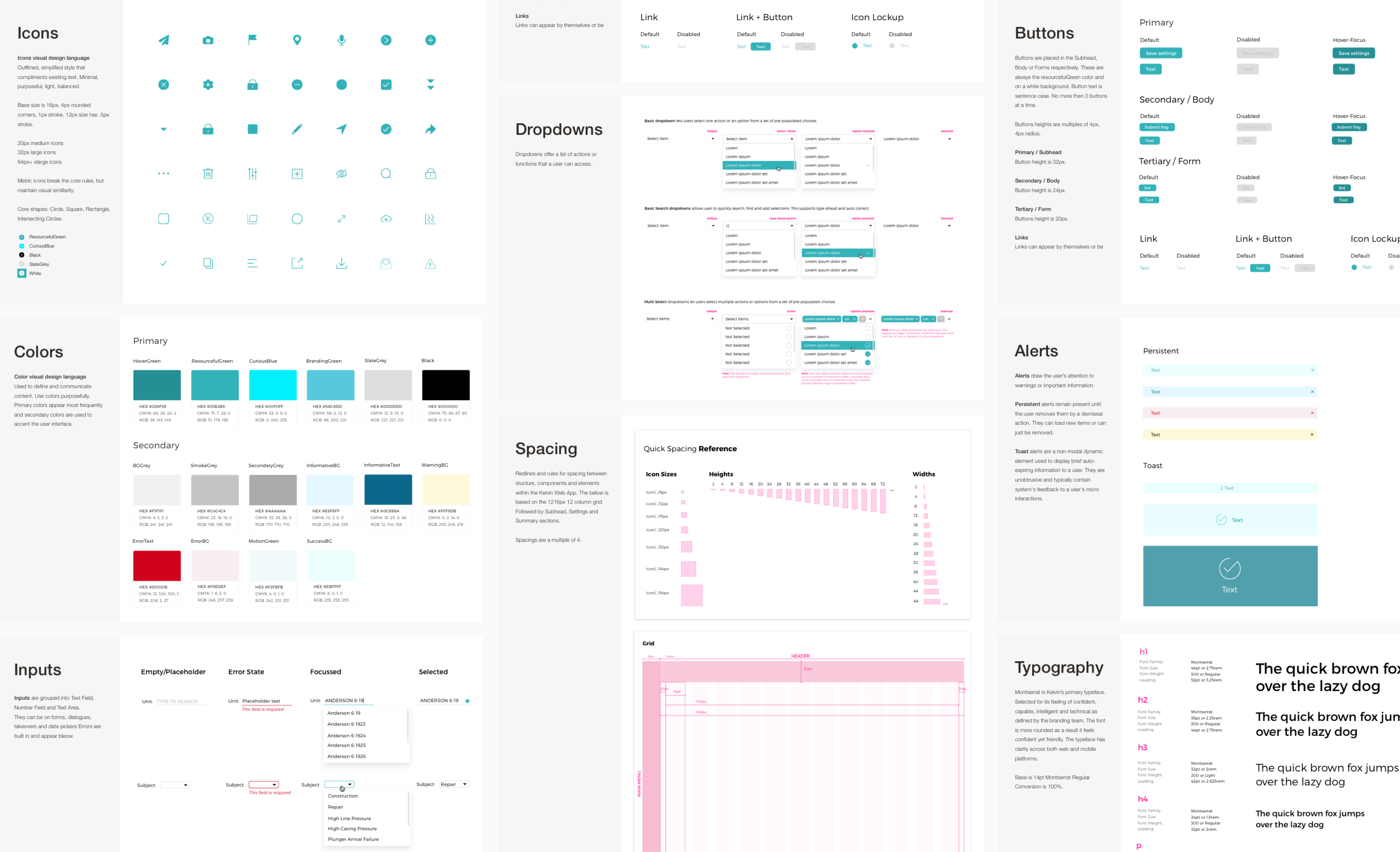
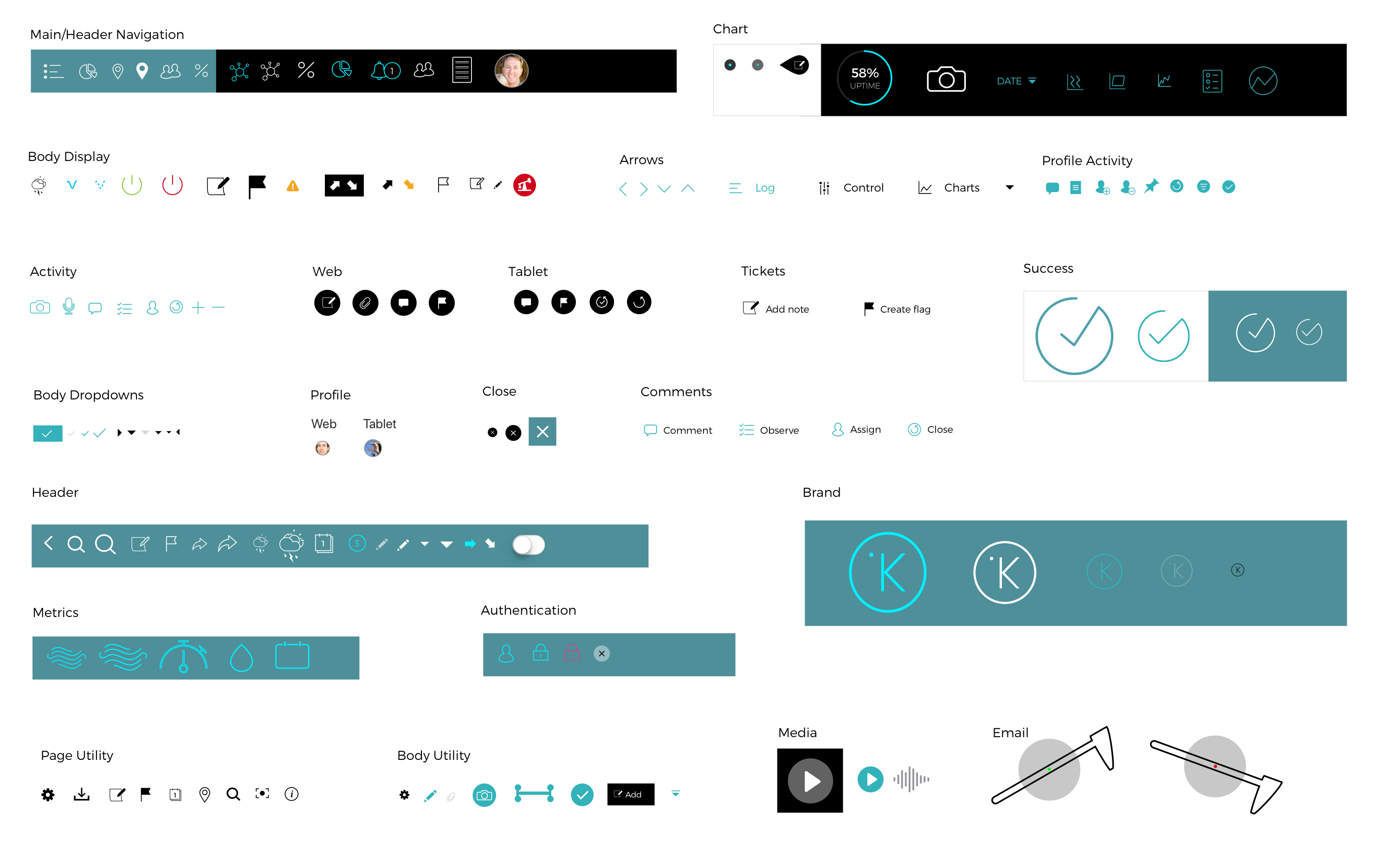
Design System Components
Below is a small sampling of the rest of the Design System visual language we did for Kelvin.