Migration Map, Human Odyssey
I designed many interactives for exhibits that the Academy held. For the Migration Map I collaborated with many internal teams within the Academy while owning the ux, design and interactions of the interface.

Problem
The California Academy of Sciences needed a template design that communicated the journey of how our species (Homosapiens) migrated out of Africa and into the Americas 200,000 years ago. The design had to compliment the Human Odyssey exhibit as a digital experience and be accessible for all ages.
Solution
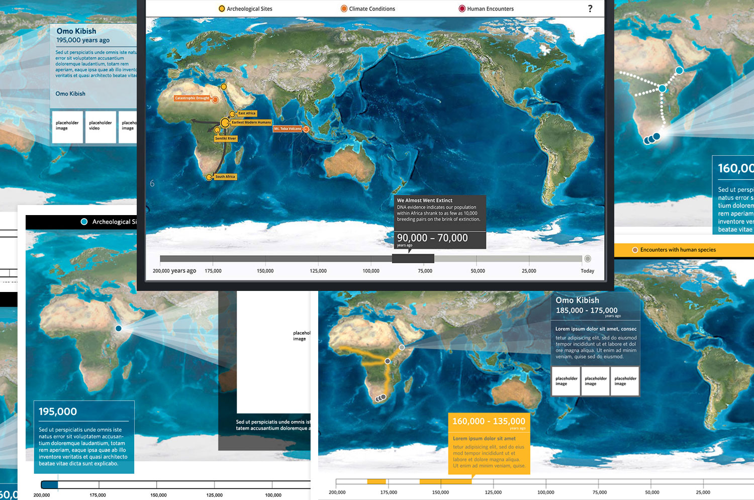
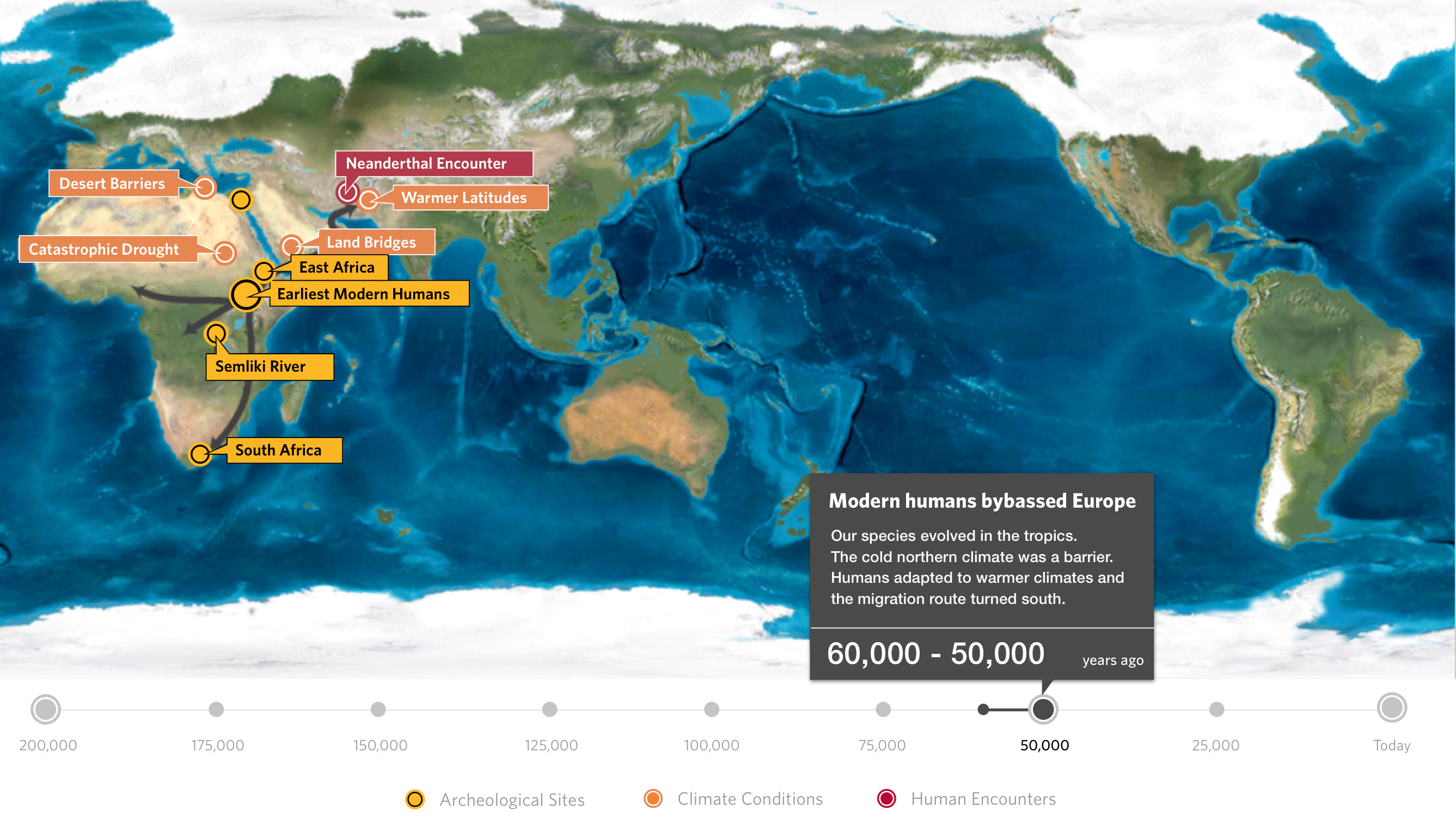
I created an interactive timeline map for visitors to discover how our species migrated out of Africa 200,000 years ago. The map illustrates this story through fossil evidence and archeological sites juxtaposed with a timeline map of climate changes and encounters with other species. It played on two large monitors in the Human Odyssey exhibit that boosted ticket sales by 20% and nominated for NSF award.
Process
The project began by understanding the assets we needed to communicate the story. We knew the experience had to be based on time, scientific evidence, weather patterns, maps and location, but we also needed to show why our species was able migrate.
We researched existing timelines, tracked down ancient world maps and poured over archeological evidence of the human odyssey.
We also needed to understand what the audience expectation would be. We chatted with our audience and it became clear that with the all the evidence and data we had to tell the story there needed to be two types of experiences. A short look and a deep dive.

Concepting
I concepted different ideas to support a user controlling their experience of moving through 200,000 years of time. Seeing evidence of species migration due to severe climate changes, sea level fluctuations, volcanic eruptions that both opened and closed migratory routes out of Africa. Touch points revealed routes and additional deep dives.
Iterations
The timeline event could last 65,000 years, others 5,000 years, so the timeline needed to communicate this to the user. Each touchpoint was a type of scientific evidence (sites, encounters, weather) that offered deeper dives. The routes revealed also had to be synced with the timeline, they had to grow correctly based off of time and be feasible to engineer.

Design
The final design allows the user to scrub to milestone events on the timeline. When these events are reached, the map shows what scientific data was found during that time.
A user can move through time and discover how the map exposes land bridges and reveals migratory routes for our species. Users can then interact with the touch points and learn more about the events and evidence that was discovered at that time.


DEMO
Here is a short demo of the timeline map: And check out the live interactive.
