Recent Work —
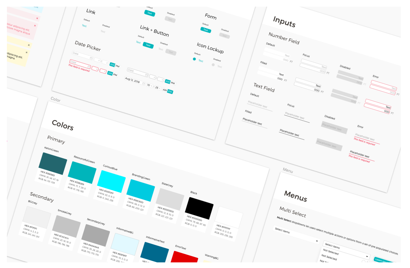
Design System | Kelvin
Kelvin is a A.I. Series C Startup whose machine sensors simplify the management of complex data systems. I created and expanded their design system so it can support the operational and data driven complexities of the industrial client base. see more »
Data Table Pattern | Kelvin
I was tasked with improving the usability of our data tables as part of our Design System effort. I designed rules and guidelines to establish truncation and adaptive columns that brought the table to industry standards... see more »
Ticket Control | Kelvin
Kelvin was limiting user engagement and trust by disabling edit and delete functionality of generated tickets. I designed the UI, UX and rules for renewed editability and delete actions in a complex ticketing system that put control back in the users hands. see more »

Skeleton Styles | Kelvin
Kelvin's data tables were taking a long time to load any type of sensor or metric data. This was causing cognitive dissonace for users as they weren't able to see available data immediately. We applied a lazy load structure that loads data progressively as skeleton styles and rendered content.
CSV Importing | Granular
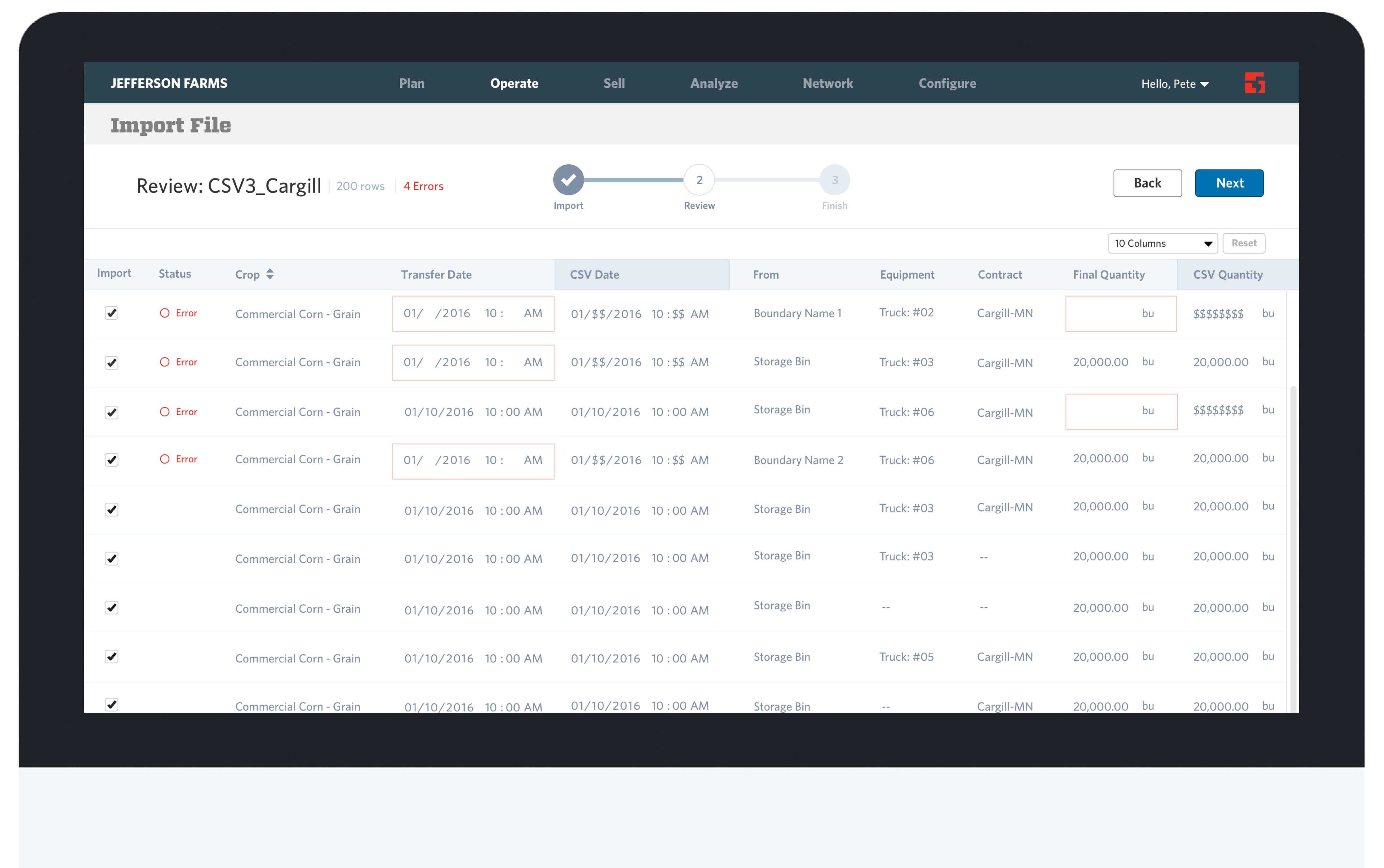
Granular, a SaaS company that creates software to help farmers manage their farming business more efficiently, needed a CSV importing tool to allow their customers to import CSV files so all data can be in one place... see more »
Financial Plans | Granular
Granular aims to provide farmers the financial tools they need to make better decisions for their farm. I designed a tool to allow them to manage and track the costs of their production and return... see more »

Style Guide | Granular
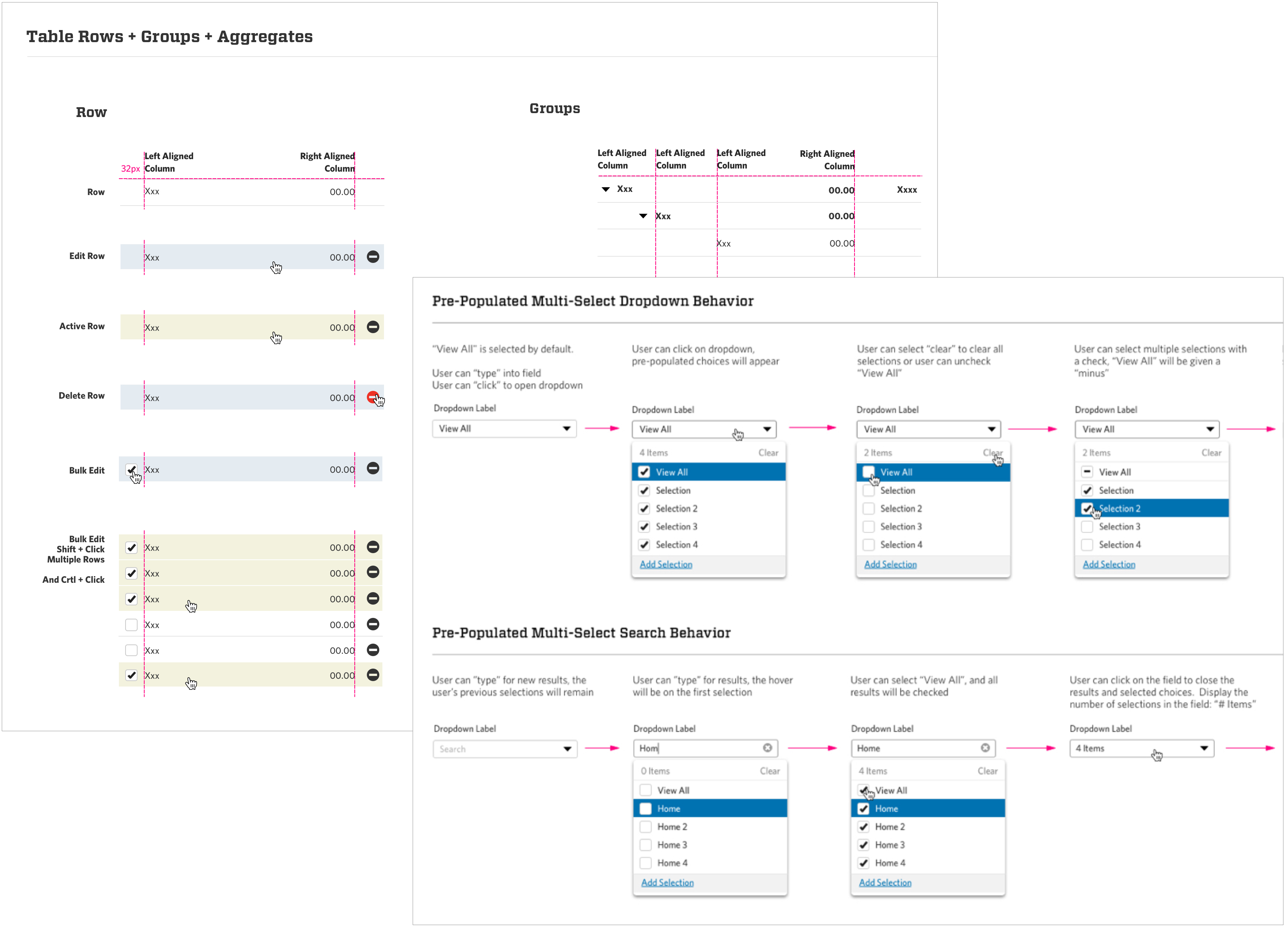
Granular was building out new features and functionality very fast, but without clear UI standards and guidelines. Accumulating a lot of design debt across web pages. I created a system of guidelines and styles for our dropdowns, tables, rows and groups.

Pivot Table | Granular
Granular needed a tool that would allow farmers to run template and custom reports on their farm. Farmers share these reports with their landowners and insurance companies.
California Academy of Sciences
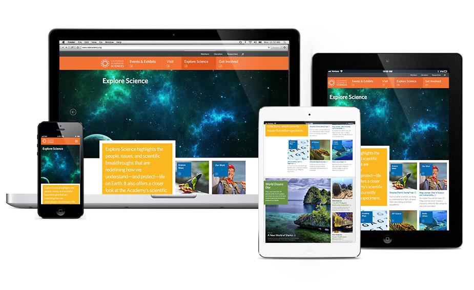
I was the lead designer on the California Academy of Sciences website redesign project... see more »


Marketing Banners | California Academy of Sciences
I designed banners that complimented the new website style guide. These banners were used on our shopping cart and email newsletters.
Migration Map | California Academy of Sciences
I was tasked with creating a design that illustrated the journey of how our species (Homosapiens) migrated out of Africa 200,000 years ago. The design would compliment the Human Odyssey exhibit as a digital experience... see more »
Exhibit Interactives | California Academy of Sciences
Living in San Francisco I am no stranger to the awesome power of Earthquakes. So I was overjoyed to have the opportunity to produce 5 data driven visual and interactive experiences that communicate the science of earthquakes to the California Academy of Sciences visitor... see more »
Animal Attraction Exhibit | California Academy of Sciences
The California Academy of Sciences needed an Ipad interface that allowed users to become immersed in the unique world of animal mating strategies and reproductive behaviors... see more »
This is a sampling of my work and design process
I have omitted much of the insights, constraints and concepts from these projects for the sake of confidentiality. I think those details are more interesting to chat about in person anyway, so I've developed some more detailed case studies that I'd be happy to share in person.


