Hello, I am Meghan Kelley and I evolve design systems that help people work better together.
I am currently looking for new opportunities on a design systems team to grow emerging or established design systems.

Greenhouse Design System | Zendesk
Zendesk’s Creative Digital team needed a more mature digital design system to support and power Zendesk.com and their Marketing initiatives. But Greenhouse, their current system was not being adopted and was in danger of being abandoned. See the case study »
- Design Systems
- Governance, product owner
- Culture change
- Interaction Design
- Visual Design, UX
- Information Architecture
- Operations
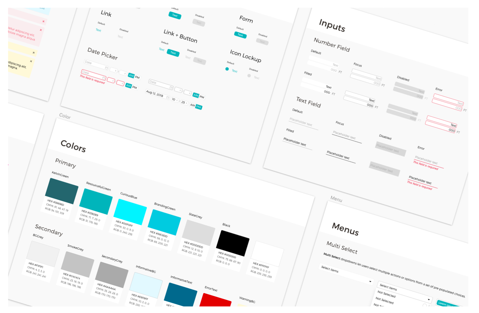
Design System | Kelvin
Kelvin is a A.I. Series C Startup whose machine sensors simplify the management of complex data systems. I created and expanded their design system so it can support the operational and data driven complexities of the industrial client base. See the case study »
- Design Systems
- Visual Design
- UI Design
Data Table Pattern | Kelvin
I was tasked with improving the usability of our data tables as part of our Design System effort. I designed rules and guidelines to establish truncation and adaptive columns that brought the table to industry standards. See the case study »
- Product Design
- Visual Design
- Interaction Design
- UX
Older work
CSV Importing | Granular
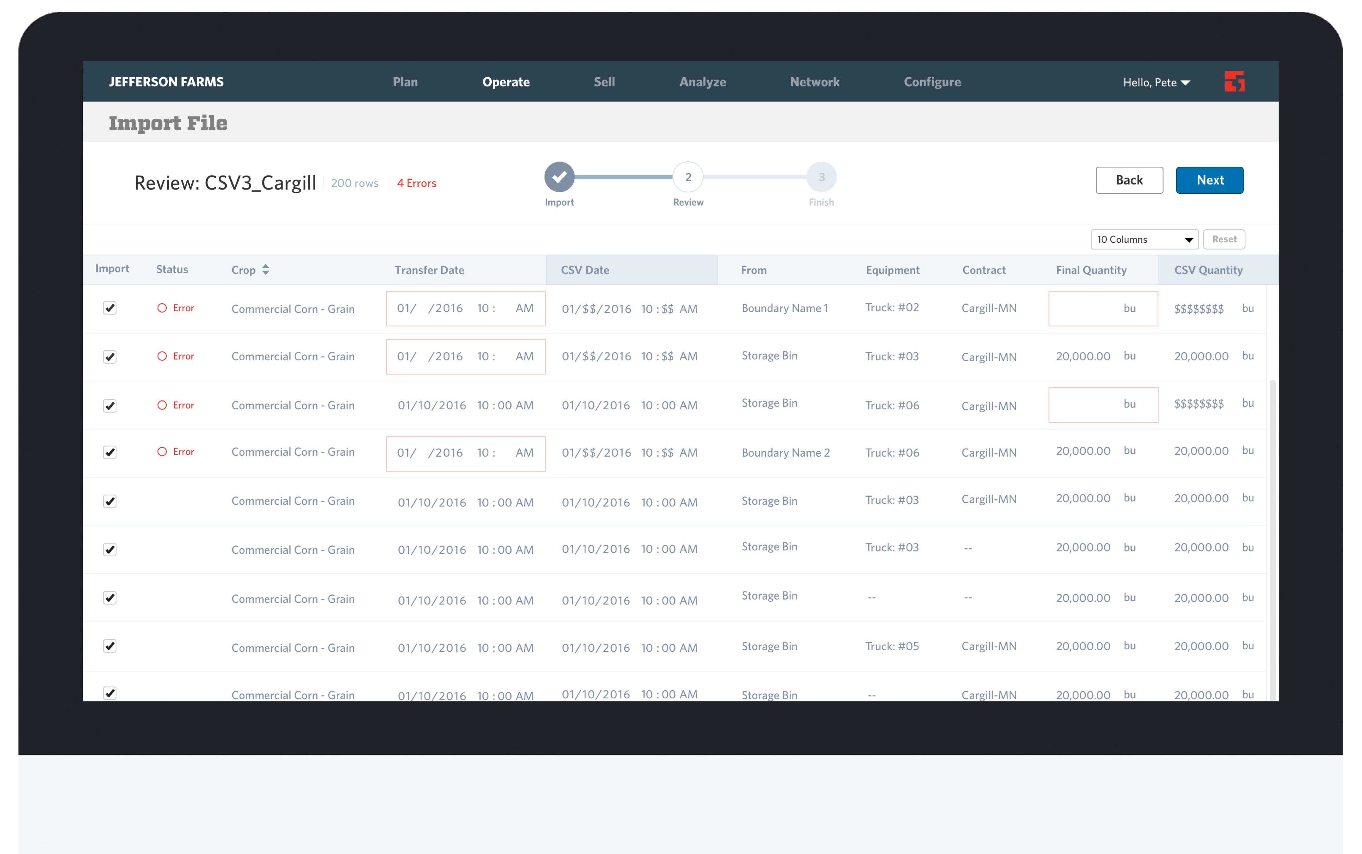
Granular, a SaaS company that creates software to help farmers manage their farming business more efficiently, needed a CSV importing tool to allow their customers to import CSV files so all data can be in one place... see more »
- Product Designer
- 2016

Style Guide | Granular
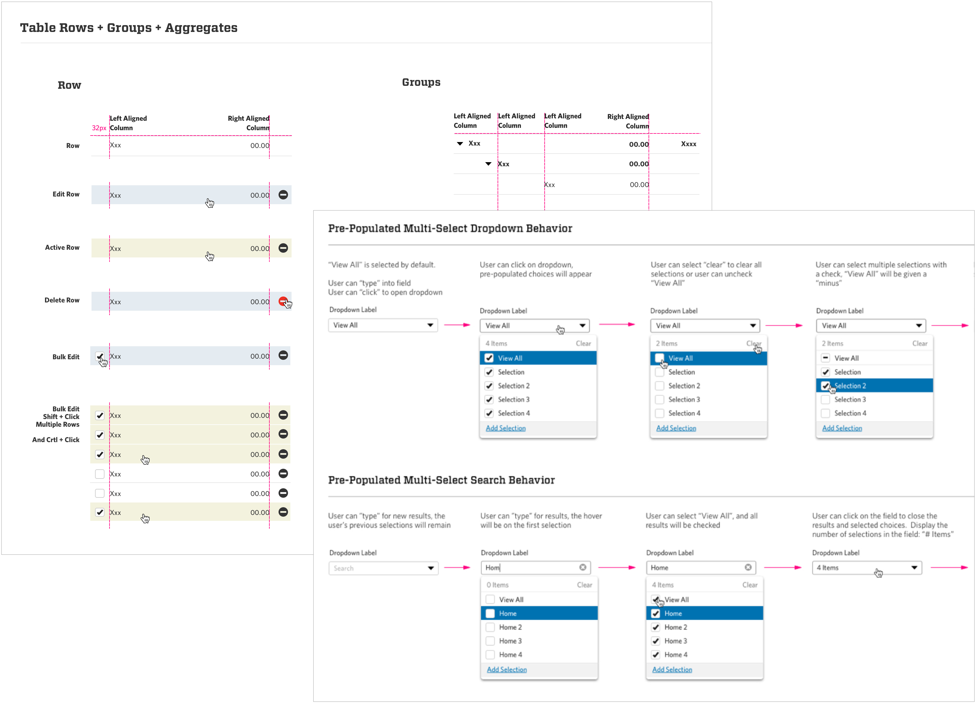
Granular was building out new features and functionality very fast, but without clear UI standards and guidelines. Accumulating a lot of design debt across web pages. I created a system of guidelines and styles for our dropdowns, tables, rows and groups.
- Product Design
- 2015
California Academy of Sciences
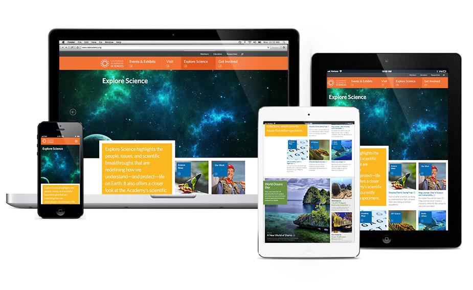
I was the lead designer on the California Academy of Sciences website redesign project. See the case study »
- Visual Design, UX
- Webby Honoree 2015
This is a sampling of my work
I have omitted much of the insights, constraints and concepts from these projects for the sake of confidentiality. Reach out to me on LinkedIn to start a conversation.


